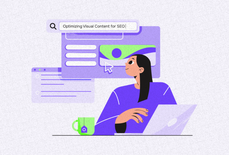
The landscape of content marketing has changed. Today, visual content like videos and images are considered more effective than blogs, articles, and other long-form content.
Despite this, numerous brands such as those under the tech and B2B niches still bank on information-led content marketing. Fortunately, there’s an effective way to deliver information to your audience without creating eye fatigue. In this blog, we’ll explore how to create effective infographics to communicate with your audience.
Understanding Infographics
Visualization is an imperative part of communication, whether it’s in business or not. Psychology suggests that the human brain processes images 60,000 times faster than text and that 90% of information transmitted to the brain is actually in a visual format. Because of this, marketers need to find a way to visualize long-form content to get better results from their audience. Fortunately, that’s possible through infographics.
Infographics use visuals and texts to present key information and ideas. Technically, it’s a creative way to share concepts, data, and other forms of information with your readers.
Here’s how the use of infographics can improve your content:
- Synthesize a long-form content
- Simplify complex ideas or processes
- Present data in a digestible manner
- Identify cause and effect
- Compare and contrast options
- Recommend solution to issues presented
Recent surveys suggest that 60% of businesses today use infographics as a part of their content strategy. Aside from this, 55% of marketers create social media infographics compared to other visual content. These figures verify that creating infographics is an effective way to boost business.
Want to learn more about the impact of visual content marketing to businesses? Read our complete article here.
Using Infographics for Business
While numerous businesses are now using infographics in their content, creating an effective one can still be tricky. Contrary to popular belief, making an infographic isn’t just about creating a visualization of your data, it’s a way to encourage your audience to get to know more about your business.
Here are some factors to consider when using infographics as a part of your content marketing:
Aligns with your marketing strategies
Don’t just create an infographic out of thin air. Like any visual content, your infographics could only be effective if they are supported by a strategic content marketing strategy. Identifying your goal is a must: Do I want to drive traffic to my website?, Do I want to introduce my offer?, Do I want to foster customer loyalty?
Presents a problem
For businesses, it’s best to use infographics to present a pain point or a problem to your potential audience. This will give them the nudge that they ought to solve this problem by connecting with your business.
For example, this simple yet effective infographic can make homeowners call their plumbers to solve leaks within their household.
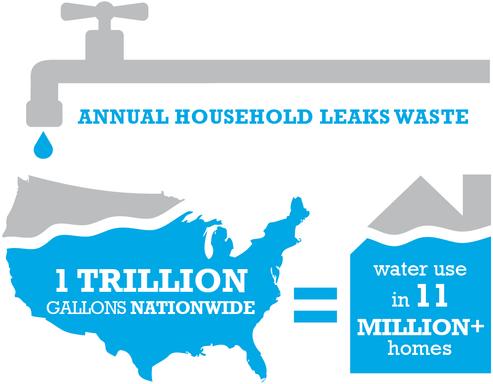
Infographic about annual household leaks. Source: EPA
Encourages readers to click on your website
While infographics should contain extensive information regarding a certain topic, it’s imperative to still leave some things for your website. Remember that aside from informing your readers, you’re using infographics to acquire potential clients. So, adding a call to action to visit your website is a must.
This company did a great job of sharing data with their readers while encouraging them to visit their website.
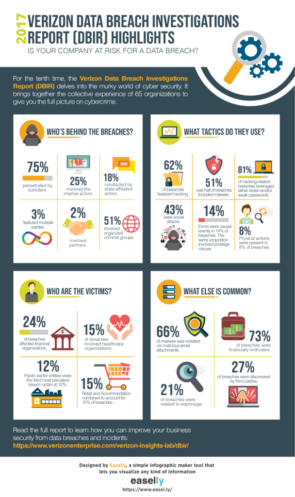
Infographic about data breach. Source: Easeslly
Optimize posting
Just like any marketing content, it’s essential to ensure that you optimize the posting of your infographics. Recent surveys suggest that infographics are deemed most effective on LinkedIn and Instagram. Aside from these two websites, you can also use infographics on your website and email marketing campaigns.
Here are two examples of LinkedIn posts with infographics. The first one was able to make the most out of his visual content by optimizing the posting of his infographic. The second one, on the other hand, is less likely to generate a high clickthrough rate because of the way he posted his infographic.
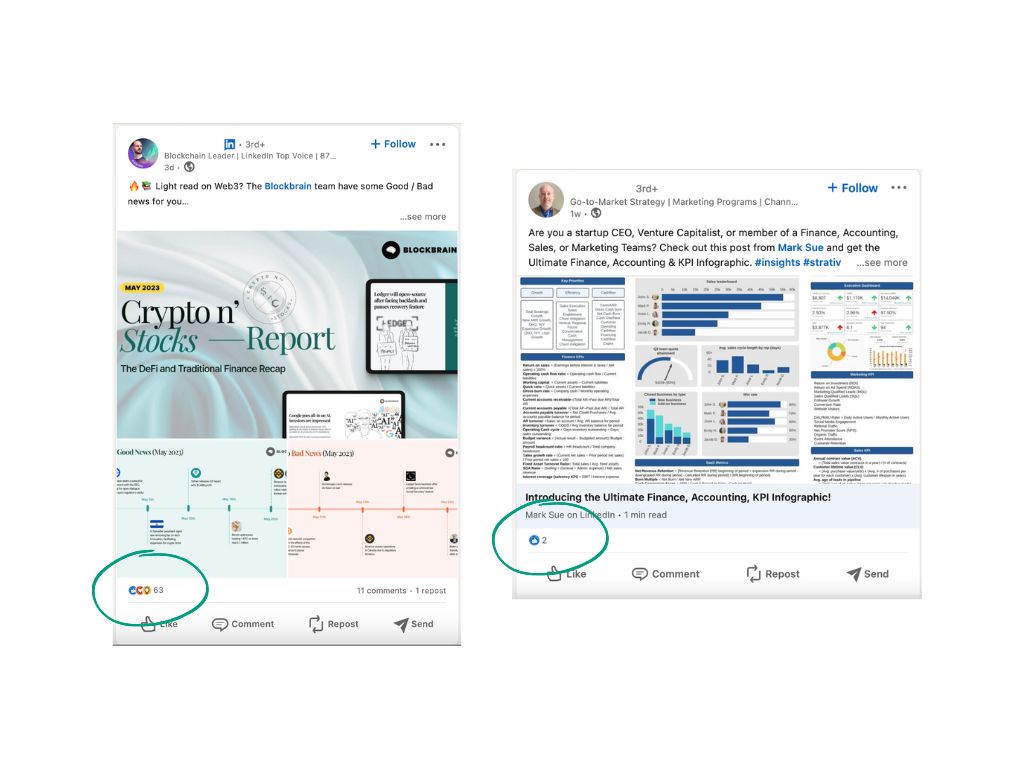
Two infographics on LinkedIn.
Creating Effective Infographics
As mentioned a while ago, creating an effective infographic can be challenging, but it’s not impossible. Here’s how you can make an infographic that will drive revenue to your business:
Identify audience
Each age group has different reading habits. The Silent Generation (76+ age) is most likely to do 35 minutes of uninterrupted reading while Gen Z (5-25 age) can only do 7 minutes of uninterrupted reading. Needless to say, if your target market belongs to the Silent Generation and Baby Boomers, you can use more text on your infographics. On the other hand, if you’re targeting members of Generation X, Millennials, and Generation Z, then using visualizations over text is better.
For example, this infographic will not resonate with its audience. While it talks about career development, therefore targeting Millennials or Gen Z, it contains more text than visualization.
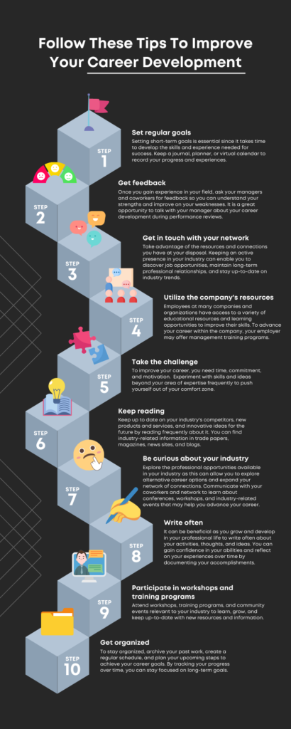
Infographic about career development. Source: Canva
Aside from this, gender also plays an important role when it comes to creating effective infographics. Studies suggest that males are more selective toward visual cues while females are more comprehensive. So, when targeting males, it’s best to fully synthesize your data. On the other hand, when targeting females, it’s best to provide as much information as you can give.
Do your research
If other visual content banks on creativity and wit, infographics depend on the information and data they contain. That being said, businesses must conduct their research if they want to create effective infographics.
While this infographic is definitely enticing to the eye, it doesn’t provide any new information about cyber security.

Infographic about cyber security. Source: Canva
Organize your data
Organizing your data is as important as doing your research. Unorganized infographics can be considered misleading, and, at times, even conceitful. Note that a single mistake in visualization can significantly affect the overall reception of your audience toward your infographic.
Here are some factors you should consider when organizing your information in an infographic:
Hierarchy
Properly utilizing visual hierarchy is easier said than done. It’s not just about placing the most important information on top of your infographic and the least ones at the bottom. Contrary to popular belief, visual hierarchy is more on size than position.
Here’s an example of how visual hierarchy works.

Quick guide on visual hierarchy. Source: Upwork
Color
Color is an integral part of organizing information. Research suggests that using color coding improves data comprehension and retention. Improper use of color can reduce the effectiveness of your infographics.
In this example, the color blue is used to represent a hierarchy. In the first section of the infographic, the highest amount is written against the darkest shade of blue, creating the impression that the darker the blue is, the higher it is on the hierarchy. However, in the succeeding sections, the lighter shade of blue is used to represent the top result on their surveys. The inconsistent use of color can create visual confusion for the readers.

Sample infographic about salary. Source: Venngage
Aside from this, when creating infographics for your business, it’s also essential to use your brand colors to improve brand recall.
To learn more about brand identity, read How Professional Graphic Design Enhances Brand Identity for Companies
Charts and Graphs
The use of charts and graphics is deemed the easiest and most efficient way to visually organize information. However, identifying the most optimal chart or graph to use for your dataset can be tricky.
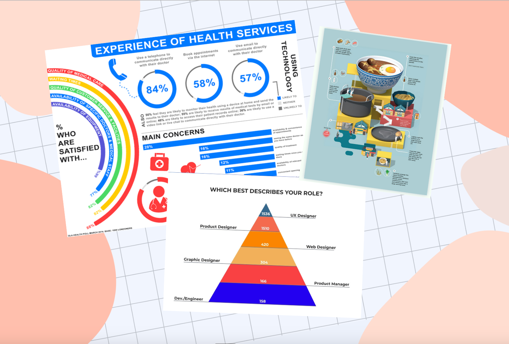
In this example, a pyramid is used to represent quantity. However, the visualization doesn’t properly reflect the data presented.
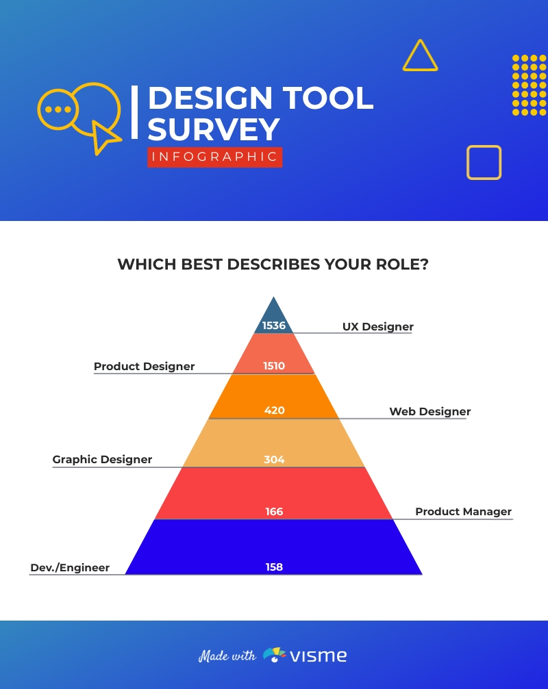
Sample infographic about digital opportunities. Source: Visme
Other visuals
Other visual elements such as icons, images, and graphics can also be used in your infographic. However, these elements should only accentuate your data and not conceal it.
In this example, the graphics took up so much space within the infographics, diverting the reader’s focus away from the information presented.

Sample infographic about land surveying. Source: Carroll Surveying
Synthesize information
Contrary to popular belief, infographics shouldn’t just summarize information. Rather, it should synthesize your data. Each graph, chart, and other visualization should work as one.
This sample infographic presented numerous data and information about health services. However, it still failed to answer the penultimate question for readers: How does the change in health services affect me?
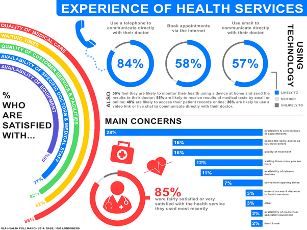
Sample infographic about healthcare services. Source: London Data
Consult with Graphic Design Experts
Creating an effective infographic is challenging. Despite this, you shouldn’t ignore its significant impact on your content marketing campaigns. Fortunately, there are graphic design service providers that will help you create infographics that can turn your leads into actual clients.
Seter Graphic Labs offers a wide range of graphic design services ranging from ads, web design, and content marketing assets. Not only do we create engaging materials, but we implement an efficient marketing plan that would help you achieve your revenue goals. By hiring a group of graphic design professionals, business owners like you can focus on more crucial parts of your business.
Want to learn more? Read our services through this link.
In Summary
Using infographics is a great way to connect with potential clients. It can show your audience what you can do for them, rather than just telling. However, remember that making effective infographics isn’t just about being creative, but rather it relies more on the collection and organization of data. So, if you’re looking for a way to boost your content marketing strategies, you might want to explore creating more infographics!