93% of all human connection is visual. So, it’s easy to say that graphics can be considered the first touchpoint of marketing. However, some businesses still see graphics as mere designs to accentuate their offers without realizing that they directly affect the company’s brand identity. The tiniest visual detail of a marketing campaign can make or break people’s perception of your brand.
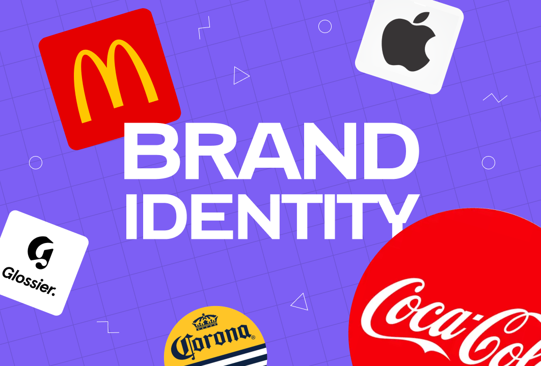
Understanding Brand Identity
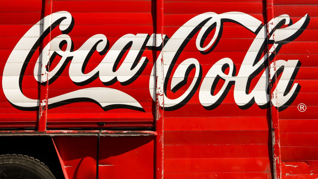
Everyone, even those outside the marketing industry, knows how Coca-Cola created the contemporary image of Santa Claus. By creating numerous visual campaigns of Santa Claus always sporting Coca-Cola’s brand color, the company successfully appropriated the holiday icon into its own marketing asset.
If Coca-Cola treated its 1931 Christmas campaign as a mere poster to push people into getting their bottles off of their grocery racks, we wouldn’t even have the Santa Claus we know today. The company realized the importance of professional graphic designs in establishing brand identity.
Coca-Cola Christmas ad through time.
Brand identity is the combination of visual elements that distinguishes a brand from other companies. It includes logos, colors, typeface, images, and now, the digital interface. Basically, it’s how businesses can create a “Hey, that’s [insert company name]!” feel from their audience.
The use of visual identity often sets premium companies apart from mediocre ones. The latter will just release random and incoherent social media graphics, while the former will streamline an entire marketing project just to cement a strong visual identity to their audience.
Power of Professional Graphic Designs
While senior graphic designers can get paid as high as $109,450 annually, the average salary of junior graphic designers is only estimated at $35,449 a year. But what’s the true worth of professional graphic design? To fully understand how graphics can make or break a brand identity, here’s what it does to marketing campaigns:
Makes first impression
Let’s admit it–graphics catch the attention of people. Regardless of how powerful your copy is, if it’s not supported by an equally powerful visual representation, there’s a high chance that people will not even notice it.
Sets a tone
Aside from catching the attention of customers, graphics also have the power to set the tone of your brand. Is your brand going to be fun, or is it going to be professional? Do you have luxury or affordable products? An excellent graphic design resonates with its audience. Furthermore, each visual detail aligns with the offer you’re presenting.
Informs audience
Visual assets should provide information about your company and your products. One of the most crucial elements of a compelling visual campaign is that it should inform the audience about your offer more than anything. To put it simply, it should convey the message, “Hey, we got this for you.”
Builds trust
Customer trust and loyalty are the ultimate objectives of establishing a powerful brand. While simple ad campaigns can easily get people to buy some products, well-executed ones can create a following. A strong visual identity can make people imagine their lives with your brand; this way, you can encourage them to support all your offers, even those yet to come.
Increases sale
Most importantly, graphic designs can drive revenue. In a study conducted by Forbes, 91% of consumers say they prefer visual ads over written content. Needless to say, to boost your sales, you must invest in professional graphic designs.
Visual Elements of Brand Identity
To understand how graphics enhance brand identity, let’s look at how leading companies use visual elements to represent their brand.
Logos
A logo is more than just a symbol used to identify a business. Whether it’s an image, a text, or a combination of both, it should be able to have a lasting impression on the audience. Furthermore, it should be flexible enough to be used for all marketing assets.
Most fast food brands have had numerous iterations of their logos throughout their history, but nothing beats the development of the McDonald’s logo that we know today. In 1961, the company released the first version of its logo showing two overlapping semicircles forming the letter “M,” pierced with an arrow-like line. It also had the name McDonald’s below the image.
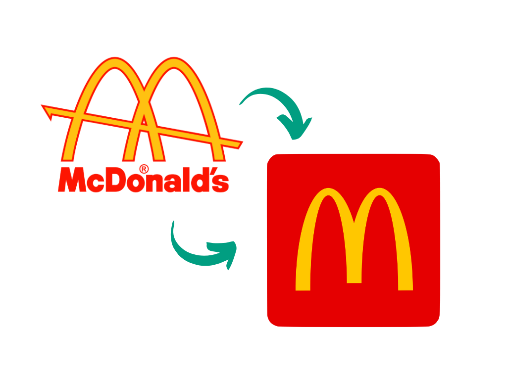
Comparison of the first and latest McDonald’s logo.
The company soon scraped out the overlapping effect, the arrow, and the McDonald’s text. They just retained the yellow letter “M” accentuated with a red background. The simplicity of the logo creates an easy brand recall among the audience.
Colors
Colors are more than just colors. They convey feelings and emotions. As mentioned a while ago, Coca-cola was able to sync its brand with the Christmas we know today. But how did it become so effective for the consumers? According to psychology, red naturally stimulates excitement, energy, and passion. In short, joy. So, it’s not surprising that the company was able to create a brand that almost automatically equates to joy.
The power of red. | Photo by Maximilian Bruck on Unsplash
Typography
Typography is one of the most commonly disregarded elements of visual identity. It’s the art of arranging letters to make texts more visually appealing to readers. Yes, your text should go beyond being legible.
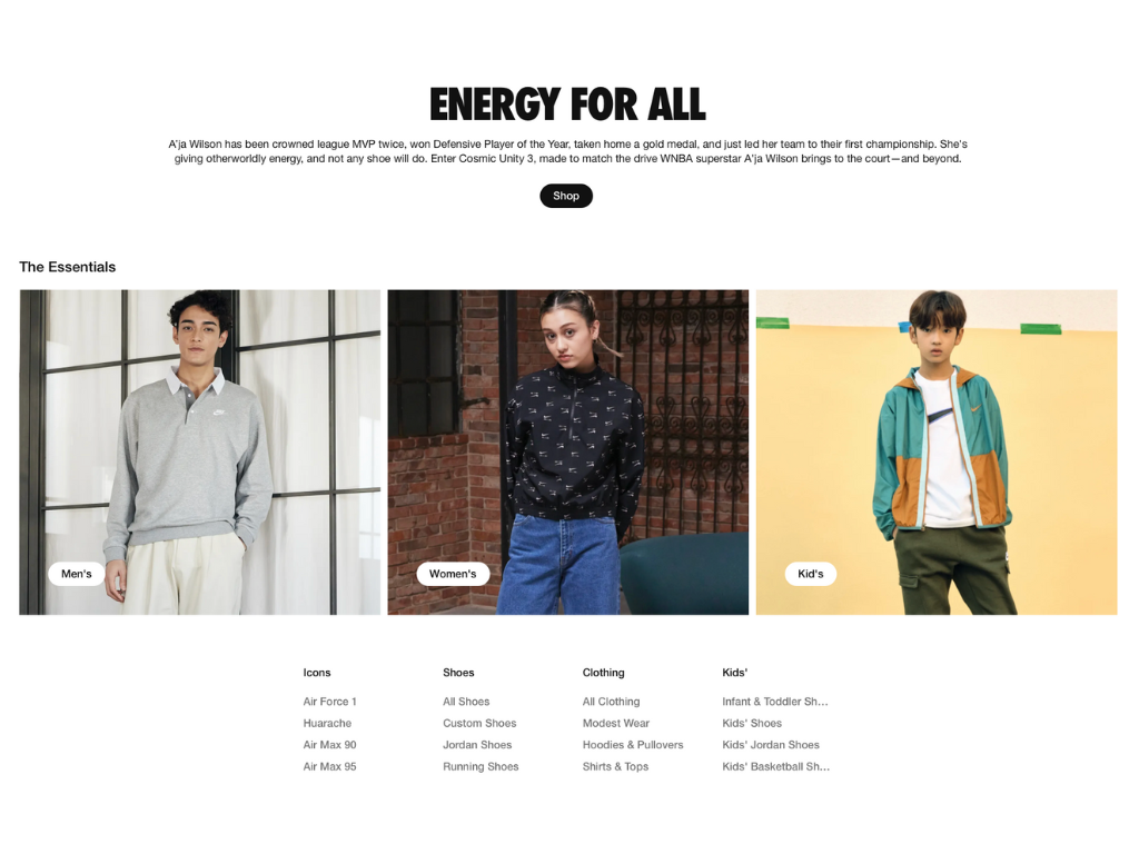
Typography on Nike’s website.
While Nike surely has excellent products, most marketers often miss out on the company’s excellent use of typography in their campaigns. Almost all of their assets use sans serif fonts, as they convey a sense of minimalism, innovation, and straightforwardness, just like Nike’s products.
Visual Assets
Images, icons, and other forms of graphics shouldn’t be treated as mere decorations in a marketing ad. When used strategically, they can further improve your brand recall towards your audience.
Corona recently released bottle-less ads to promote their drive to return Corona bottles to local stores. All of their images were completely Corona-free. But why do their posters still shout that it’s a Corona ad? Because it features beach and sunshine, two things that have always been consistent throughout Corona campaigns.
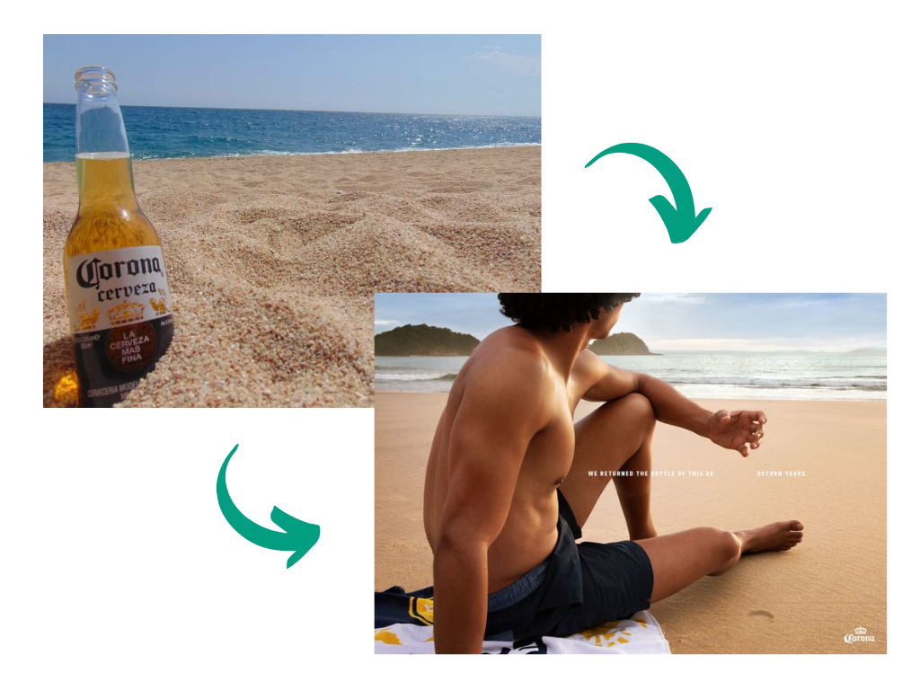
Caption: Corona’s use of the beach and sun. | Photos from Ad Age and Kristina L.
Interface
The digital era has introduced yet another visual identity element: user interface (UI). It’s the overall design of a software or device, including the colors, graphics, layout, and typography.
Apple’s iOS revolutionized the UI design movement. While other gadgets were maximizing every graphic they could use, Apple went for a clean and minimalist interface. The design created the feeling of seamless integration within their gadgets’ features.
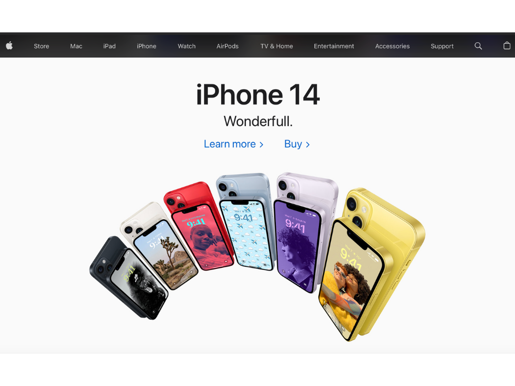
Apple’s minimalist website.
Establishing Visual Elements of Brand Identity
Creating a strong visual identity isn’t done overnight. It requires reinforcement to generate a strong reception from the market. Here’s what marketers should do to condition their audience’s mind towards their visual assets:
Coherence
All visual elements of a brand should feel like one. Each advertisement, be it print or digital, should exude harmony. No visual element should feel out of touch, even if a campaign introduces a new or a flagship offering. For example, while Glossier has a wide selection of beauty products, all of their individual ads show skin, aligning with their message “Skin First, Makeup Second.”

Two products on Glossier’s website.
Without coherence, a company might not be able to create a solid foundation for its brand.
Consistency
Consistency, on the other hand, is the ability of a company to present its brand across all channels in the same way. If you want to establish a brand that exudes fun and excitement, all of your visual representations should do the same. For instance, the minimalism of Apple goes beyond its UI as the company also creates simple yet sophisticated marketing campaigns.
Lack of consistency among marketing campaigns can be detrimental to the brand identity, as it may reduce brand recall among the audience. Regardless of how powerful your ad is, people might be unable to remember it.
Communication
Whether it’s just a symbol or an image, all facets of your visual identity should communicate a message. When you’re building a brand, you’re not just telling people to buy your products but instead to buy the lifestyle or ideology your products represent.
In 2017, Dove drew flak for its advertisement that showed a woman of color removing a shirt and turning into a white woman. It’s far from the brand identity that made them popular, which is embracing beauty in all forms.
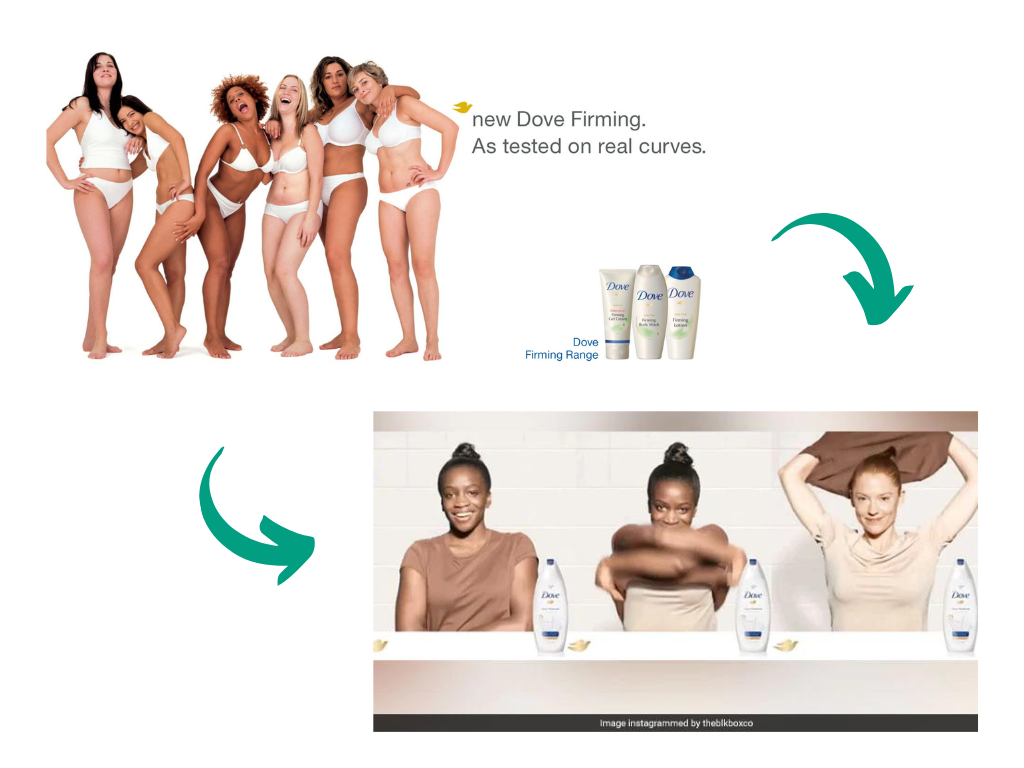
Caption: Dove ads. | Photos from NDTV and Effie
Level Up Your Brand Identity
In the digital age, graphic design has become integral to marketing. Gone are the days when visual marketing was all about producing creative assets. Now, marketers should strategically utilize each visual element to create a powerful brand identity. So, if you want to rise above your competitors, you must invest in professional graphic design services such as Seter Graphic Labs.

Seter Graphic Labs helps create a consistent visual language across all marketing materials, including logos, websites, packaging, and advertisements. Our professional designers have the expertise to design cohesive and visually appealing elements that accurately represent the essence and values of the brand.
Most importantly, we can help you differentiate your company from your competitors. By creating unique and memorable visual identities, you can stand out in crowded markets and leave a lasting impression on consumers.
Want to learn more about Seter Graphic Labs services? Click here.