Responsive website design is now one of the most crucial elements of digital marketing. Even if you have fully-optimized social media content or engaging email newsletters, if your customers aren’t greeted with a responsive website, then you’re less likely to generate sales.
In this blog, we’ll explore how to create responsive website designs to ensure a seamless user experience.
Understanding Responsive Design
Developing responsive web designs aims to build websites that adapt and function well on various screen sizes and devices. It entails creating websites with coding and design that enables them to automatically change their functionality, content, and style according to the user’s device, be it a desktop computer, smartphone, or tablet. Responsive design guarantees that websites give the best viewing experience, with simple navigation, readability, and usability across all devices and resolutions. It leverages flexible grids, fluid images, and CSS media queries. In addition to removing the need to develop different mobile versions of websites, a responsive design also offers a uniform and seamless user experience across marketing platforms.
Elements of a Seamless User Experience
While designing a responsive website might be challenging, it’s not impossible. Here’s how you can ensure that your website design provides a seamless user experience:
Mobile-friendly layouts and navigation
The navigation and appearance of websites must be optimized for mobile devices in order to provide a seamless user experience. It is essential to build and navigate websites specifically for smaller screens as more people visit websites through mobile devices. In order to do this, a responsive design strategy must be used, which modifies the layout and content to fit different screen sizes and resolutions. Simple layouts that are optimized for mobile should be used to make the material accessible and readable. It is essential for directing users across the website to have clear, succinct navigation menus that are simple to tap and interact with.
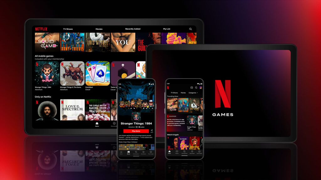
Since Netflix offers plans for television, desktop, and mobile use, their website has an impressive mobile-friendly layout. Users across different mediums can experience the same viewing experience.
Fast loading times and performance optimization
A flawless user experience on websites depends on quick loading times and performance optimization. Users have higher expectations for website loading rates in the fast-paced digital environment of today. Websites that load slowly may drive visitors away in frustration and abandonment, costing businesses potential customers. It’s crucial to reduce file sizes, compress pictures, make use of browser caching, and effectively distribute content using content delivery networks (CDNs) in order to improve performance. Additionally, lowering the number of HTTP queries and optimizing the code can greatly speed up loading times. Mobile performance needs to be optimized because users on mobile devices are very sensitive to page speed.
Intuitive touch interactions and gestures
For a flawless user experience on websites, especially mobile devices, intuitive touch interactions, and gestures are crucial. Because touchscreens are so common, users anticipate that websites will respond quickly to their touch inputs. Implementing features like swipe motions, pinch-to-zoom capability, and tap targets that are simple to recognize and trigger are all part of designing intuitive touch interactions. To accommodate various finger sizes and avoid unintentional taps, it is crucial to take into account the size and positioning of interactive elements. The overall user experience is improved by offering visual feedback, such as animations or color changes, as users interact with touch elements.

Common Challenges and Solutions
Regardless of how exhaustive your design efforts are, you will still encounter issues with your website design. Here are some common challenges designers and developers face in creating a seamless website design and their corresponding solutions. If you’re developing your website today, then it’s best that you anticipate these issues as early as now:
Planning your wireframe
A crucial component of designing a seamless website user experience is dealing with complex layouts and content hierarchies in creating your wireframe. When it comes to adjusting them to various screen sizes and devices, complex layouts, such as those with several columns, sophisticated grids, or interactive components, might present difficulties. However, businesses may get around these issues and guarantee a consistent user experience across all platforms by utilizing responsive design strategies. Maintaining usability and readability can be achieved by simplifying and prioritizing material for smaller screens, making use of accordions or collapsible menus, and carefully rearranging pieces. A better user experience may also be achieved by implementing breakpoints and media queries to modify layout and content display dependent on screen size.
Just like how they say, a seamless website design starts with a seamless website wireframe.

Addressing image and media optimization
Optimizing images and other media is essential for a flawless website user experience. Images and other media components are crucial for grabbing consumers’ attention and effectively delivering information. But slow loading times and poorly optimized media can be detrimental to user happiness. Businesses may guarantee quick loading times across devices by compressing photos without sacrificing quality, selecting the right file formats (such as JPEG or WebP), and adopting responsive image strategies. Further enhancing performance, lazy loading techniques can be used to only load media elements when they are visible to the user. Additionally, descriptive text for photos should be included in alt tags to improve accessibility and SEO.
For this reason, one of the best practices in designing a website is to ensure that all visual assets are properly compressed before uploading them directly to the website. This way, you’ll know that each graphic won’t affect the loading time of your website.
To learn more about the importance of visual content on your website, read The Role of Graphic Design in Website User Experience for Companies
Handling navigation menus and menus on mobile devices
It’s crucial to handle navigation menus on mobile devices to ensure a seamless user experience on websites. Smaller mobile devices require the optimization of navigation menus due to their limited size. The use of a hamburger menu icon, which compresses the menu into an expanding and collapsible style, saves important screen space. It is crucial to make sure the menu is well-labeled, easily visible, and has enough space between items to avoid inadvertent taps. The user’s comprehension and interaction with the menu can be improved by implementing fluid transitions and animations. Additionally, it’s crucial to take the user’s context and intent into account while creating mobile menus.

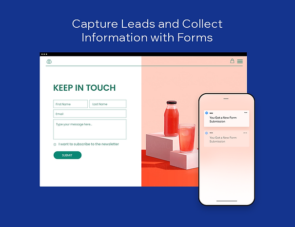
Handling forms and input fields
The management of forms and input fields is essential for ensuring a seamless user experience on websites. Forms are frequently required for collecting user data, such as contact information or purchase submissions. It’s crucial to design forms with user-friendliness in mind, especially for mobile devices. Forms should be modified to accommodate smaller displays and provide enough room for input using responsive design strategies. Auto-fill and auto-correction functionalities can be used to speed up data entering. Additionally, users can be helped to complete forms accurately and quickly by offering clear instructions, making use of descriptive labels, and employing error validation in real time.
While forms and input fields may be a minute concern in web designing, it plays an integral role in your marketing efforts. These forms and input fields allow you to get leads that you can convert into clients.
Fortunately, there are website creation service providers that offer pre-made form templates that are optimized both for desktop and mobile use. Here’s an example from Wix.
Achieve a Seamless User Experience on Your Website
Creating responsive website designs may be tricky, but it’s imperative to provide an excellent customer experience. Without it, your potential clients might get all confused when accessing your offers on their desktop or mobile devices. Fortunately, Seter Graphic Labs is here to help you create graphic designs to ensure a seamless user experience on your website.
Seter Graphic Labs produces well-executed graphic designs that contribute to a website’s overall visual appeal and aesthetics, enhancing its professional and polished look. Furthermore, our team employs visually appealing layouts, typography, and imagery to guide users’ attention and make navigating and consuming the information presented easier.
Most importantly, Seter Graphic Labs will help you optimize the user experience by effectively adapting to different screen sizes and devices. Our responsive design ensures that the website’s visual elements and layouts adjust dynamically to provide a seamless experience across various platforms, including desktops, tablets, and smartphones.
Want to learn more about Seter Graphic Labs services? Click here. Remember that once you provide a seamless website experience to your customers, converting them into paying clients will be easier!
