Marketing has become increasingly competitive. Now, businesses should utilize all visual elements to establish a strong brand personality, including typography. In this blog, we’ll explore how text designs create a lasting impact among your customers that will help you boost your revenue generation.
Importance of Typography in Brand Identity and Design
Typography plays a significant part in determining brand identity and design as it’s a potent visual tool for communicating a company’s personality and values. Recent surveys suggest that a business’s choice of typography affects how its audience perceives it, leaving an immediate visual impression that establishes the mood for the entire brand experience.
The appropriate font may elicit feelings, build credibility, and convey the distinct voice of the brand. The choice of fonts can subconsciously affect how consumers perceive and process your message. Aside from this, consistent use of typography establishes a uniform and unified visual language across numerous marketing platforms and aids in differentiating a brand from its rivals. Because it becomes a crucial component of the brand’s visual identity, typography also improves brand recall and awareness. Brands may successfully communicate their messaging, build a strong brand presence, and develop a closer relationship with consumers by choosing and utilizing typefaces for their target audience.
How Typography Influences Brand Personality
Typography is crucial in determining brand personality by visually communicating the company’s character, values, and overall identity. Typeface selection, font styles, and other typographic components express particular characteristics and arouse particular feelings. An inventive and strong sans-serif typeface, for example, might convey a brand’s current and creative personality, whilst a traditional serif typeface may inspire a sense of tradition and refinement. Additionally to the brand’s identity, the typography’s weight, spacing, and placement can portray humor, professionalism, or refinement. Typography may also promote brand coherence and develop a recognizable visual language that develops the brand’s identity over time.
A great example is Nike’s typography. The brand uses sans serif font to invoke its modern, innovative, and creative aura. Aside from this, the hero banner on their website also uses a typewriter font to go with their retro campaign.
Selecting the Right Typography
Choosing the right typography for your brand requires ample planning. To help you with this, here are some factors you should consider when finding the typography for your company.
Researching target audience and brand values
Understanding the brand’s values and conducting market research on the target audience is crucial when it comes to typography. Brands may learn a lot about their target market’s expectations and views by researching their demographics, preferences, and psychographics. This information aids in choosing a font that appeals to the target market and effectively conveys the brand’s messaging.
Moreover, preserving consistency and authenticity requires that typography is in line with brand values. In order to create a strong and consistent brand identity, the typography should convey the brand’s personality, tone, and basic beliefs. For instance, a company that values simplicity and minimalism would choose a clean, elegant font, while one that wants to evoke excitement and energy might go with strong, dynamic typefaces.
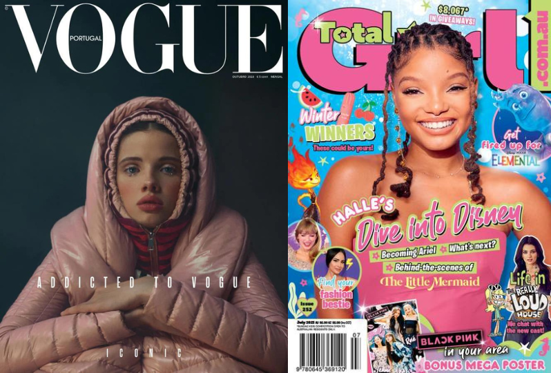
Look at these two magazines. Vogue targets professionals, elites, fashion enthusiasts, and other people who may have access to high-end fashion. For this reason, they use a combination of typefaces that emphasizes their cover. On the other hand, Total Girl targets tweens. Thus, their typeface invokes a fun and youthful vibe.
Analyzing different typography styles
Selecting the best font for a brand’s design requires careful consideration of several typography motifs. The several font classes must first be explored and understood, including serif, sans-serif, script, display, and more. Every style has its distinctive traits and conveys various visual messages. Designers can assess a typographic style’s legibility, readability, and aesthetic appeal by looking at examples of that style.
Additionally, understanding the symbolic significance and contextual relevance of various styles can be gained by looking at their historical and cultural ties. Analyzing how each typeface style fits with the firm’s values, target market, and desired brand identity is crucial. Trying out various typeface combinations is another option to help determine the best pairing or contrast between primary and secondary fonts.
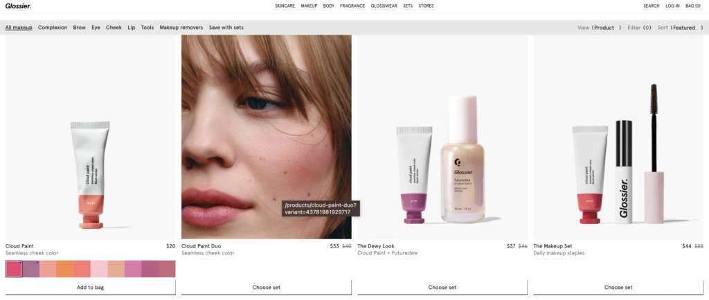
For example, Glossier’s tagline is “skincare first, makeup second.” For this reason, their cosmetic products lean more on creating fresh and natural looks. They typeface does, too, as they use minimalist text to emphasize the benefits of their products.
Considerations for legibility and readability
For effective user interaction and communication, brand typography must be readable and legible. Many things need to be taken into account to do this. First and foremost, it’s crucial to choose a typeface with distinct letterforms and adequate character spacing. Because they are straightforward and readable in print and digital media, sans-serif typefaces are frequently preferred. Next, font size is quite important for reading, especially in various contexts and media. To choose the best font size, it’s vital to take the intended use and viewing distance into account. In order to ensure legibility, it is also crucial to take into account the contrast between the font and background. While low contrast can make it difficult for the eyes to read, high contrast makes it easier to read.
Finally, to ensure legibility and readability across numerous platforms, the font should be tested across a range of devices and screen resolutions. Regular user testing and feedback can yield insightful information that can be used to improve the typography of a brand for maximum legibility and readability.
To learn more about how visual elements ensure a seamless user experience, read our article Responsive Design for Websites: Ensuring a Seamless User Experience
Disney+ uses sans serif font with big spacing. This allows their content to remain legible even on their mobile platform.

Typography Elements for Brand Personality
Now that you know how to do ample market research for your typography, let’s now explore the typography elements that will help you build your brand personality.
Typeface
The process of selecting a certain typographic design for a brand’s visual identity is known as typeface selection. It entails taking into account elements like the form, organization, and aesthetics of typefaces. As mentioned a while ago, the choice of typeface has a significant impact on a brand’s personality since it establishes the tone and sends a clear visual message. For instance, although a traditional serif typeface might create a sense of heritage and timelessness, a sleek and modern sans-serif design can present a current and inventive company image. The typeface you choose should complement your brand’s values, target market, and overall identity.
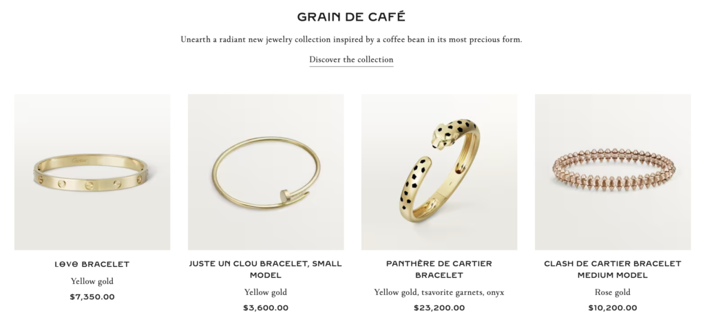
Cartier remains to be the top luxury jewelry brand in the market today. For this reason, they use serif font in the majority of their content. This helps them maintain the timelessness of their brand.
Font weight, style, and spacing
The fundamental typographic components of font weight, style, and spacing have a big impact on a brand’s personality and visual identity. To learn more about this, let’s go through these elements one by one:
- Font Weight – The thickness or weight of a typeface’s characters. Lighter weights might suggest an air of grace or delicacy, whereas bold, heavy weights can communicate strength and power.
- Font Style – Italic, oblique, or ornamental font styles lend personality and emphasis to the typography. It can strengthen the brand’s voice, demonstrate originality, or evoke a certain feeling.
- Tracking and Leading – Character and line spacing has an impact on the typography’s overall readability and aesthetic appeal. While large spacing might conjure openness and grace, tighter spacing can imply modernity or compactness.
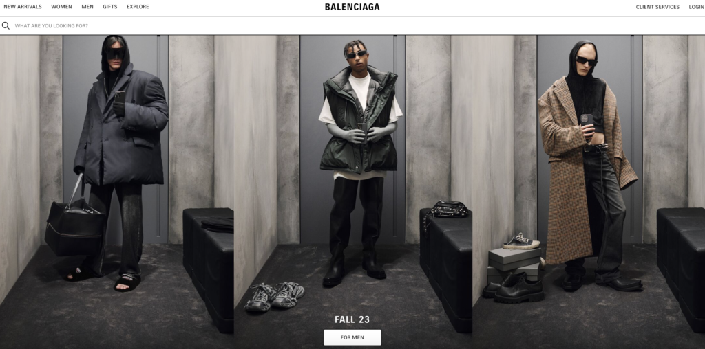
Balenciaga uses bold and tight space in most of its content. Thus, their campaigns effectively communicate a sense of power and modernity which resonates with their audience.
Color Psychology
The study of how colors affect people’s feelings, perceptions, and behaviors is known as color psychology. It looks at the associations and feelings that various hues can arouse. Color psychology has a big impact on a brand’s personality and the way its audience perceives it when it comes to branding. Each color has psychological connotations of its own and can arouse various emotions. Warm hues like red and orange, for instance, might conjure vigor, passion, and excitement, whilst cool hues like blue and green, on the other hand, can inspire serenity, harmony, and trust.
Most software development companies go with the color blue, except for Red Hat. The company strategically uses the color red, which effectively creates the impression that they are a more vigorous and innovative software solutions provider.

To learn more about how colors affect your brand, read Choosing the Right Color Palette for Branding and Marketing Materials.
Decorative Elements
Lastly, the use of visual elements can also affect your typography, specifically the use of ornaments, decorations, or original design components that are inserted within the typography itself. These ornamental components have a significant impact on the personality and visual identity of a company. They can enhance the typography’s overall appearance and character by adding flair, innovation, and originality. For instance, fun images or icons can portray a more whimsical or youthful personality, while ornamental flourishes or swashes can generate an air of refinement or sophistication.
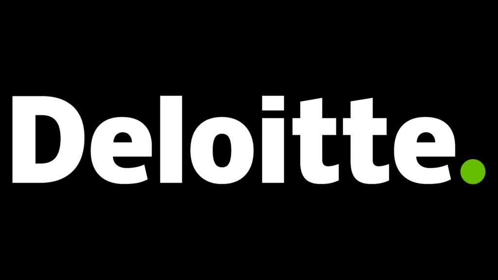
Deloitte is the perfect example of this one. The company added a small green dot to its company logo. Green is usually seen as a symbol of finance in the business industry. Thus, with that just one small visual element, the company is able to inform its audience about the nature of its brand.
To learn more about how visual elements affect your brand identity, read How Professional Graphic Design Enhances Brand Identity for Companies.
Get the Perfect Typography for Your Brand Today
Finding the right typography that will help you establish your brand identity may be tricky, but it’s inevitable for businesses. There are numerous considerations you have to worry about, which can be increasingly difficult if you’re not an expert in design. For this reason, it’s best to hire professional graphic designers to aide you in creating the perfect typography for your brand.
The professional designers of Seter Graphic Labs possess the expertise and knowledge required to effectively translate a brand’s personality, values, and messaging into visually compelling typographic elements. Furthermore, we have a deep understanding of typography principles, including font selection, spacing, hierarchy, and legibility, ensuring that the typography aligns with the brand’s objectives.
If you want to create typography that will help you boost your marketing campaigns, you can book a free call with Seter Graphic Labs today.