Data visualization is a crucial aspect of data analysis, as it allows you to quickly explore patterns, trends, and relationships in your data. Pandas, being a versatile library, provides built-in plotting tools based on Matplotlib that make it easy to create a variety of visualizations. In this tutorial, we will explore the different types of plots you can create using Pandas and how to customize them to fit your needs.
Basic Plotting with Pandas
Pandas provides a simple and convenient interface for creating plots directly from DataFrames and Series objects. By default, Pandas uses the plot() method to create line plots, but you can also specify other types of plots, such as bar plots, scatter plots, and histograms.
Let’s start by creating a sample DataFrame with some random data:
import pandas as pd
import numpy as np

# Set a random seed for reproducibility
np.random.seed(42)

# Create a date range
date_range = pd.date_range(start='2021-01-01', end='2021-12-31', freq='D')

# Create random data for sales, customers, and product categories
sales_data = {
    'date': date_range,
    'sales': np.random.randint(50, 200, len(date_range)),
    'customers': np.random.randint(10, 100, len(date_range)),
    'category_A': np.random.uniform(0, 1, len(date_range)),
    'category_B': np.random.uniform(0, 1, len(date_range)),
    'category_C': np.random.uniform(0, 1, len(date_range))
}

# Create a DataFrame with the sales data
df = pd.DataFrame(sales_data)
print(df.head())
date sales customers category_A category_B category_C
0 2021-01-01 152 10 0.240146 0.600517 0.643578
1 2021-01-02 142 43 0.075863 0.665037 0.526403
2 2021-01-03 64 57 0.128880 0.175371 0.731590
3 2021-01-04 156 98 0.128046 0.914412 0.081630
4 2021-01-05 121 10 0.151903 0.418771 0.060352Line Plots
Line plots are useful for visualizing the change in a variable over time or for comparing multiple variables. To create a line plot using Pandas, you can simply call the plot() method on a DataFrame or Series object:
df.plot(x='date', y='sales')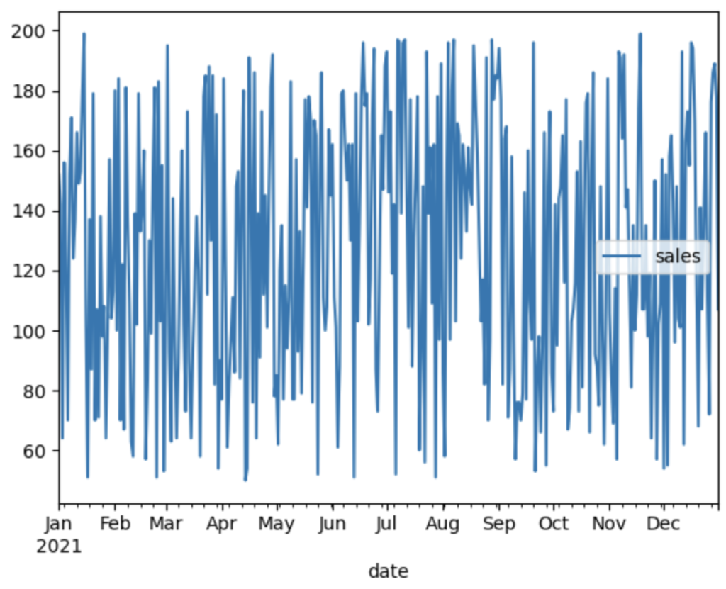
This will create a line plot showing the sales data over time.
Learn more about working with DataFrames in our tutorial on understanding Pandas DataFrames.
Bar Plots
Bar plots are great for visualizing categorical data or for comparing values across different categories. To create a bar plot using Pandas, you can specify the kind parameter as 'bar' when calling the plot() method:
df.head(10).plot(x='date', y='sales', kind='bar')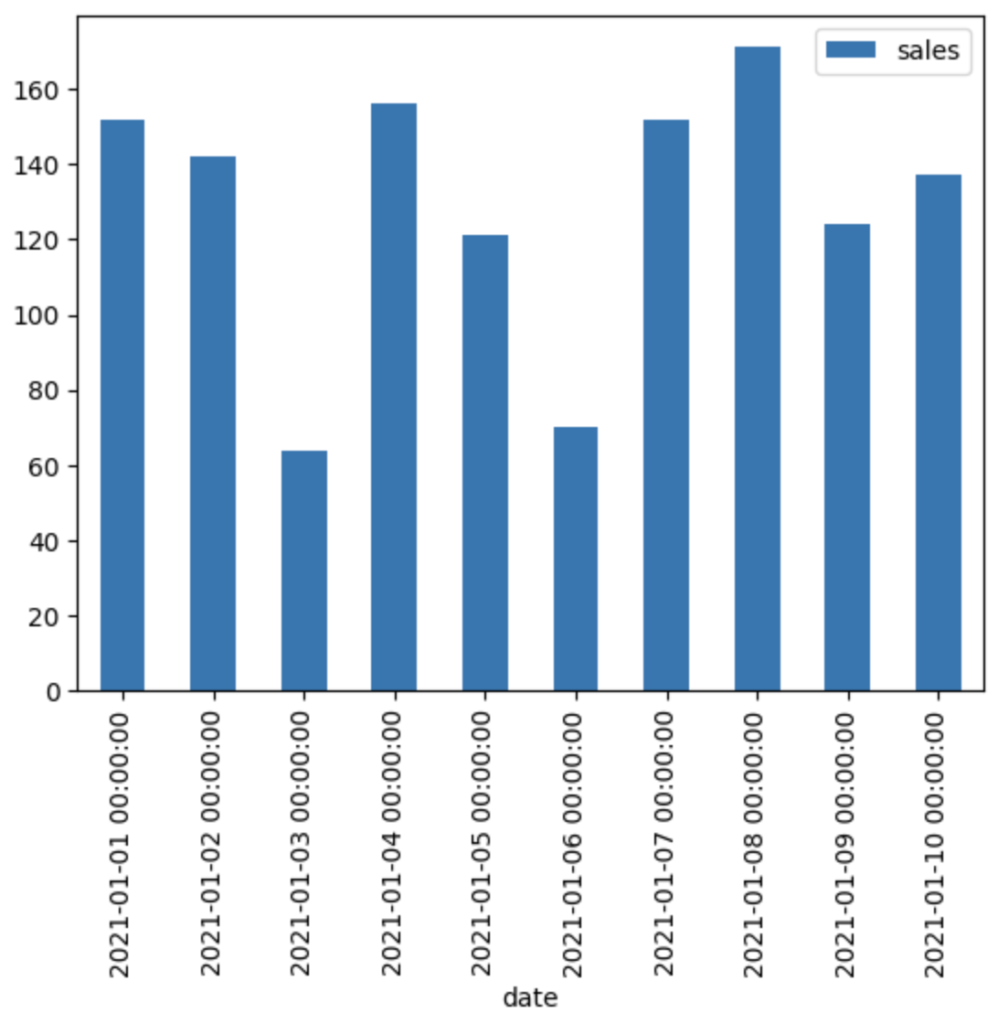
This creates a bar plot showing the sales data for the first 10 days in the DataFrame.
Scatter Plots
Scatter plots are useful for visualizing the relationship between two variables. To create a scatter plot using Pandas, you can specify the kind parameter as 'scatter' when calling the plot() method and provide the x and y parameters to indicate which columns to plot on the x and y axes, respectively:
df.plot(x='sales', y='customers', kind='scatter')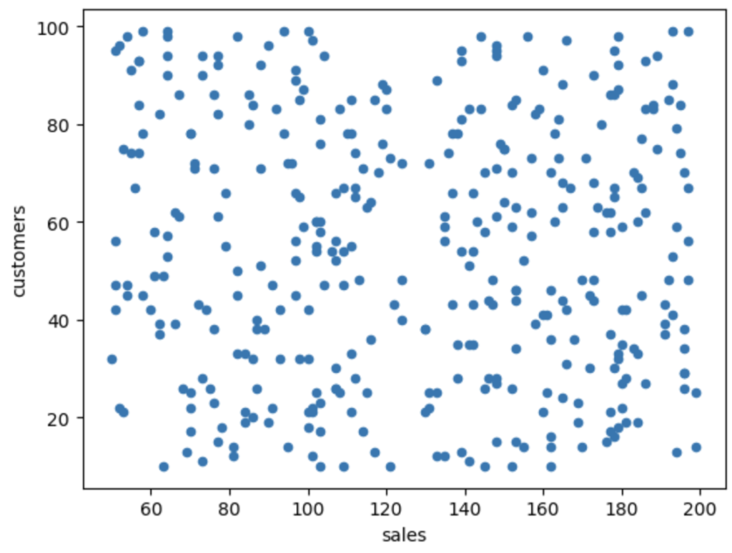
This creates a scatter plot showing the relationship between sales and the number of customers.
Histograms
Histograms are used to visualize the distribution of a single variable. To create a histogram using Pandas, you can specify the kind parameter as 'hist' when calling the plot() method:
df['sales'].plot(kind='hist')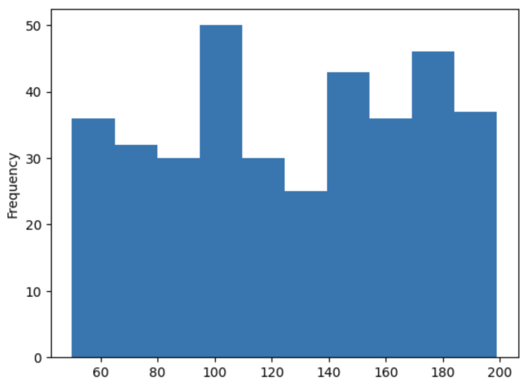
This creates a histogram showing the distribution of sales data.
Learn more about Pandas data transformation techniques in our tutorial on applying functions and mapping.
Customizing Plots
While the default settings for Pandas plots are often sufficient for exploratory data analysis, you may want to customize your plots to make them more informative or visually appealing. In this section, we will cover some of the most common customization options available in Pandas.
Changing Plot Style
You can change the overall style of your plots using the style parameter. For example, you can change the line style, marker style, and color for a line plot:
df.plot(x='date', y=['category_A', 'category_B', 'category_C'], style=['--', 'o-', '.:'])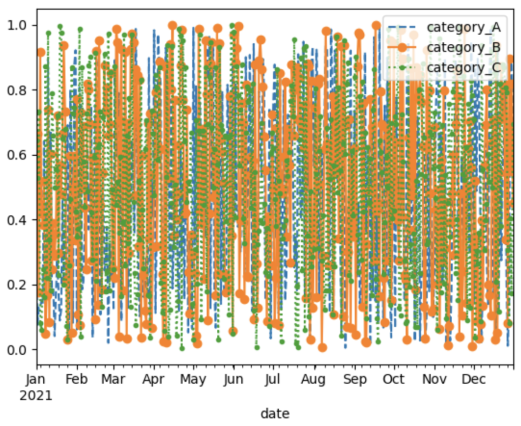
This creates a line plot with dashed, circle-marked, and dotted lines for category_A, category_B, and category_C, respectively.
Adding Titles, Labels, and Legends
Adding titles, axis labels, and legends can help make your plots more informative. To add these elements, you can use the title, xlabel, and ylabel parameters:
df.plot(x='date', y='sales', title='Sales Over Time', xlabel='Date', ylabel='Sales', legend=True)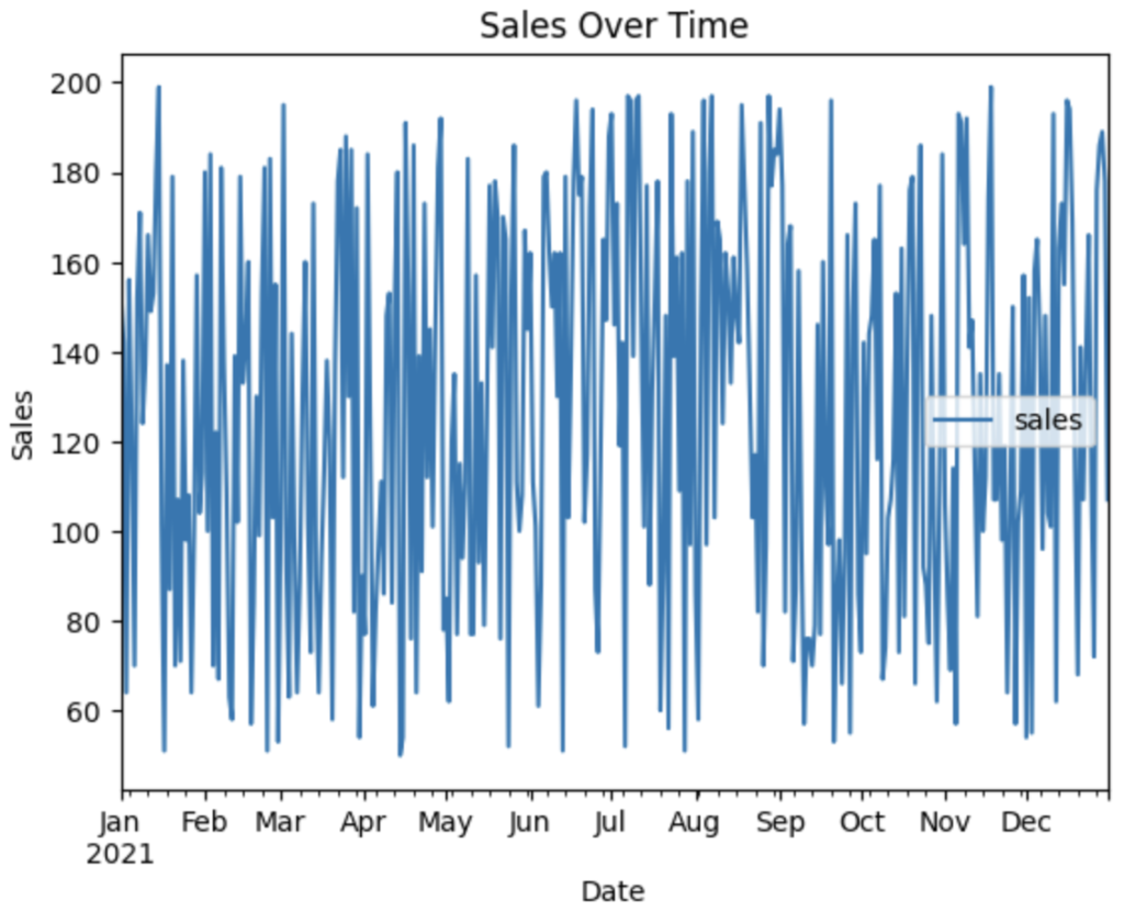
This creates a line plot with the title ‘Sales Over Time’, x-axis label ‘Date’, y-axis label ‘Sales’, and a legend indicating the sales data.
Customizing Legends
You can customize the legend by accessing the `legend` object returned by the plot() method. For example, you can change the legend location, font size, and number of columns:
ax = df.plot(x='date', y=['category_A', 'category_B', 'category_C'])
ax.legend(loc='upper left', fontsize='large', ncol=3)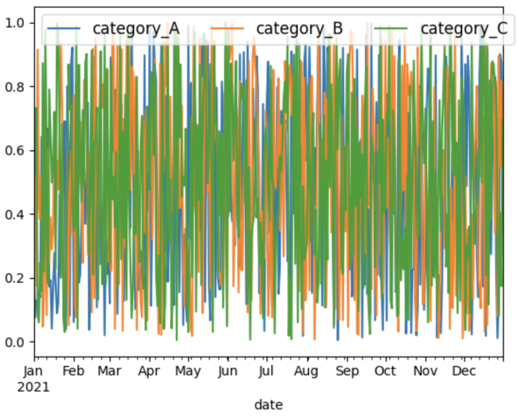
This creates a line plot with the legend positioned in the upper left corner, large font size, and three columns.
Customizing Colors
You can customize the colors used in your plots by providing a list of colors or a colormap to the color parameter. For example, you can use custom colors for a bar plot:
colors = ['red', 'blue', 'green']
df.head(10).plot(x='date', y=['category_A', 'category_B', 'category_C'], kind='bar', color=colors)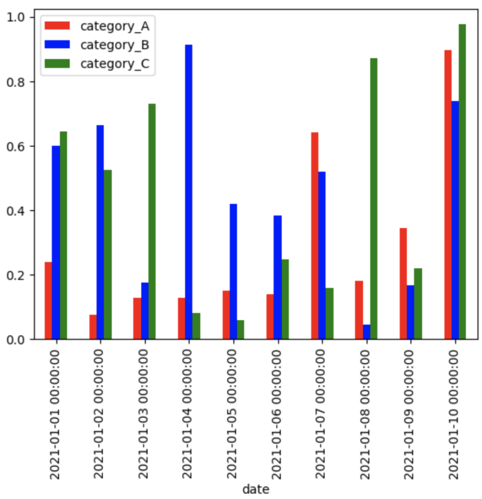
Or you can use a colormap for a scatter plot:
df.plot(x='sales', y='customers', c='category_A', kind='scatter', colormap='viridis')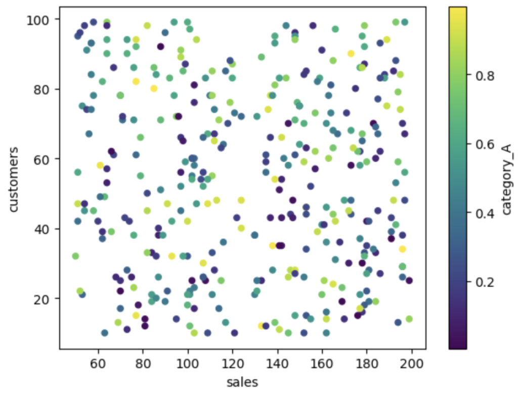
Advanced Plotting Options
While Pandas’ built-in plotting tools are powerful and easy to use, you may sometimes require more advanced visualization capabilities. In these cases, you can combine Pandas with other visualization libraries, such as Matplotlib or Seaborn.
For example, let’s create a pair plot (a scatter plot matrix) using Seaborn to visualize the relationships between all pairs of variables in our DataFrame:
import seaborn as sns

sns.pairplot(df.drop(columns=['date']))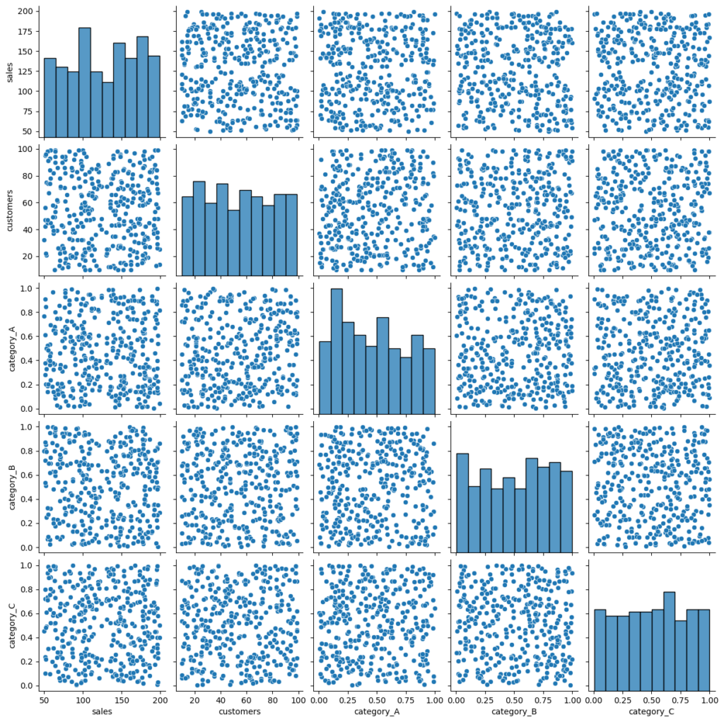
Another example is creating a heatmap using Seaborn to visualize the correlation between variables in our DataFrame:
corr_matrix = df.drop(columns=['date']).corr()
sns.heatmap(corr_matrix, annot=True)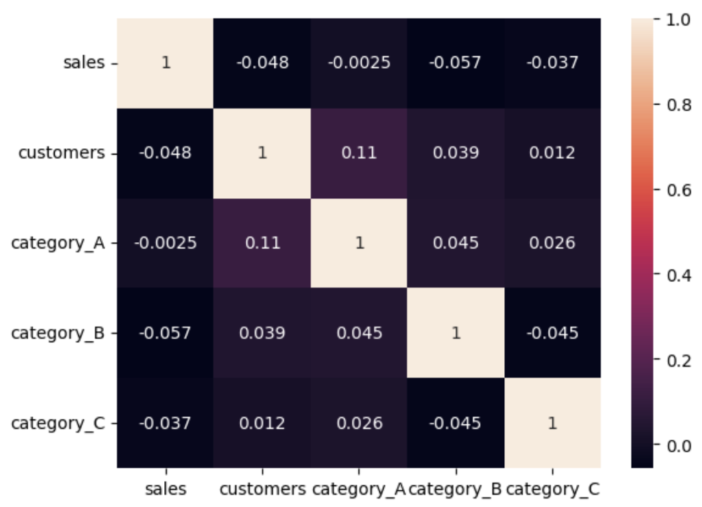
Learn more about grouping and aggregating data with Pandas in our tutorial on the power of GroupBy.
Conclusion
In this tutorial, we explored the built-in plotting tools provided by Pandas for data visualization, including line plots, bar plots, scatter plots, and histograms. We also covered various customization options to make your plots more informative and visually appealing.
By mastering Pandas’ built-in plotting tools, you’ll be able to quickly and efficiently visualize your data, making it easier to explore patterns, trends, and relationships. To further develop your Pandas skills, consider exploring related topics like time series analysis with Pandas.